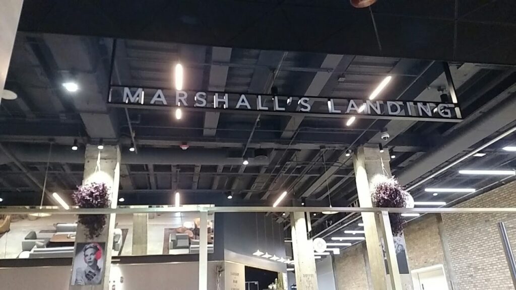
 When a hot new café in Chicago wanted some impressive signage to draw in the crowds, who did they turn to? The ER2 crew, that’s who! Located atop the Grand Stair on the 2nd floor of Chicago’s iconic Merchandise Mart, Marshall’s Landing is theMART’s center of gravity for gathering, socializing, eating, drinking, noshing, caffeinating and working. We actually did some initial logo branding for them when they opened, so we were familiar with the space.
And what a space! This vibrant venue features a world class collection of furniture from top international designers, a grand bar, and a spectacular private dining room overlooking the Chicago River. Pretty classy, huh? No problem. We’re pretty classy people ourselves. (Who’s that laughing?)
Seriously, we knew from the start this job had to be done with some real style to match the existing environment. The assignment was to partner with a Chicago design firm to leverage the cafe’s location by adding additional branding elements. These were designed to draw customers in from the first floor of theMART and from exclusive suites on the levels above, making Marshall’s Landing a focal point from all directions.
 Practical and Pleasing
Each component of the design had a job to do. “Blade” signs would come off the columns to communicate clearly the wide variety of services offered (Eatery – Bar – Coffee). Illuminated rail signs would be positioned to catch the eye from below, as well as from the hallway coming off the main suites. Finally, placement of directory signage at the bottom of the stairs was designed to entice visitors on the first floor to join the party.
That took care of the “what” and “why.” It was up to us to provide the “how.” The first question was what materials would best suit the requirements. For the blade signs, we selected a combination of aluminum background with bronze dimensional lettering to soften the effect. The long rail signs were made of aluminum tubing, with the channel letters illuminated with dimmable LEDs. This would allow the restaurant to control the ambiance depending on the time of day. We thought flat cut brushed bronze lettering on the staircase walls would add a bit of elegance and be inviting.
 We Love Challenges
According to Nick Fracasso, the Account Executive assigned to the project, “We were given about two months from the initial survey to having the signs ready to hang. These were custom pieces in brand new positions, so that was cutting it pretty close.”
The rail signs were a particular challenge because of the distance they come down from the ceiling. Their 15 foot length was a concern, as well, because the design called for 9 inch aluminum letters between the rails for the entire length. That’s a lot of weight and the risk of sagging was a distinct possibility. Then the signs had to be connected to a power source. Oh, and the rail signs were mounted into the “deck,” which is basically the bottom of the floor of the level above the café. That would take some diplomatic negotiations with the tenants upstairs!
 How We Made It Work
In collaboration with our friends and graphic designers at Media-Objectives, we started by drafting comprehensive technical drawings detailing every single specification so the completed installation would be a spot-on match to the client’s vision. We conducted multiple surveys throughout the process to ensure positioning for the signage was perfect and the installation method chosen would work without a hitch. Finally, full size samples of the rails and lettering were produced to work out how the lighting, style and finishes would look in the actual space.
Was There Any Doubt?
The results, as you can see from the accompanying photos, were striking, stylish and yes, classy. We told you we were classy people! If you would like ideas on how our grand format services can help your business stand out, please contact us.


